
I was on a mini vacation in the Wallowas, last week in Oregon, and will talk about that in an upcoming post, but I do want to get back to Part II of “To Enhance or Not . . . ” So continuing from the prior post’s discussion of when to enhance, when to use a texture or another exposure in a picture, members of a forum I’m part of shared some great sites where you can get free textures to use, and I will be sharing those sites at the end of this post.
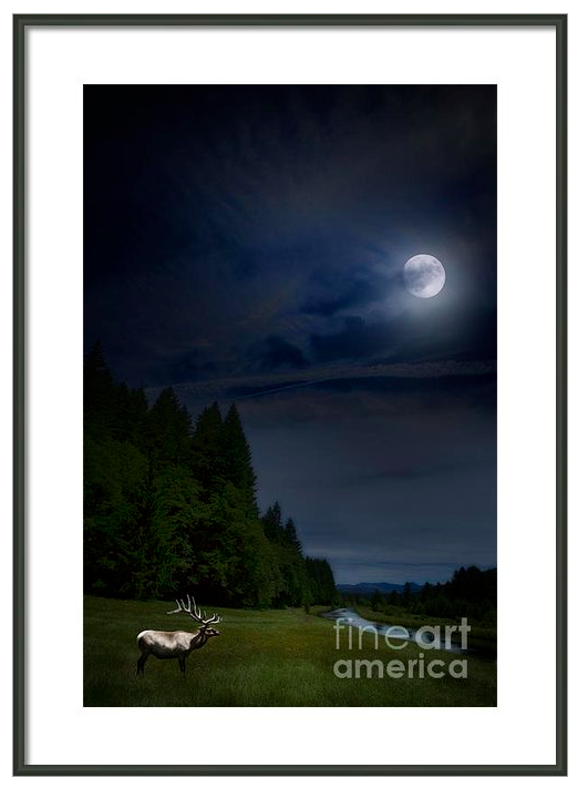
This post will mainly be discussing enhancements or composites, and when I evaluate a photograph and decide a texture is not needed. The first example I will show here is a composite photograph. I had three photos I had taken, that just didn’t stand on their own.
The first was of an elk that I took in Yellowstone, last summer. The elk was beautiful with a huge antlers, but there was a dead log with a lot of branches just behind him that were distracting and made the photo too busy. The second photo was taken of the Leaburg Canal in the afternoon, and I had already post processed some similar photos, so just didn’t want to do one more. The third photo was of the moon and I have a file folder full of those.
I started with the daytime shot of Leaburg Canal, and using Color Effex and Viveza (both from Nik Software), I changed the photo to a nighttime scene.
Then I brought the elk in a new layer, and adjusted hue and brightness to match the scene. He was initially facing the other way, and I turned him around to face the water and moon as I thought that was a more pleasing composition. I also made sure that his hooves were covered by some of the grass from the first photo (using the cloning tool at different opacities to look more natural and blur slightly his outline, so he doesn’t just look pasted on top of the other photo).
Lastly I used the photo of the moon on a new layer, also working with the edges of the moon, and using another layer of the clouds over the moon with masks so that it would be more natural with the clouds drifting over the moon. Then I worked adjusting the brightness and colors of the sky and grass, again, so that it looked natural to my eye. I’m not trying to fool anyone that I was out there at night shooting an elk under the moon. I’m just creating an artistic work using my photographs.
I used Photoshop as my main software, as I really feel most comfortable and more in control working with layers and masks. I can tone down or change the effects very easily working with masks, without having to start from Square I.
Work like this allows me satisfies the creative part of me that doesn’t want to always be chained to reality or faithful representations!
However, there are times when I don’t want to enhance a picture (more than the usual post processing typically used by most photographers and akin to darkroom techniques).
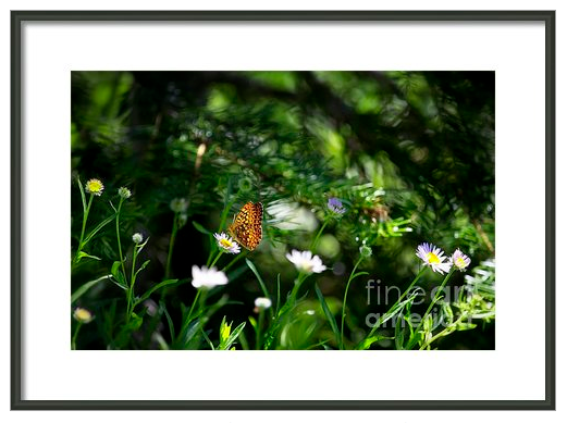
This photograph, A Butterfly’s World, is similar to Butterfly Ripple of Part I of this post. Both with shot with a telephoto lens, at a 5.6 aperture (shallow for the telephoto) at a shutter speed of 320. I was a bit closer to the butterfly in Butterfly Ripple (BR) – 2.9m subject distance and 360mm focal length) than to the butterfly of A Butterfly’s World (ABW) – the 4.2m subject distance and focal length 400mm . Also the ISO was 125 for BR vs the 100 ISO for ABW, but all in all, pretty similar shooting conditions. However, in this photo, the colors of the background were not in competition with the butterfly’s orange, so the butterfly stood out more, and also the background, because of the further distance was more defined. I liked the capture of the butterfly within its environment in this photo as opposed to not really feeling like the other background added anything besides beautiful color.
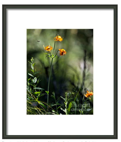
In the next photo, Making a Beeline, the background is diffused because of the shallow atmosphere as in the background of Red Dragonfly on a Dead Plant from Part I. But in this photo, there is some definition of the other plants, and in Red Dragonfly, the diffused area was mainly darker color, then lighter with no texture or anything of interest. Of course, I’m only now analyzing while I did one thing or another because I’m writing this blog. 🙂 Generally it is going to be an instinctive choice on whether the photo stands on its own or needs something more or needs something less.
I’m not an expert or even close to one. This blog is a way of sharing my journey with photography. Textures are great to work and play with, and I really love enhancing photos, but only when they need it. I promised you some websites for textures where others have shared what they have created for others to use, but I do want to say, that as beautiful as some of these textures are, it will be better and more personal if you can in some way make it your own by combining it with another texture you may have, playing around with them to change the appearance and suit your own photo in a more individualistic way. Remember to change-up the blending options and opacities and play around with blurring, levels, and of course the masks to bring in more or less of a texture or another exposure.
The one site I was most impressed with was: http://shadowhousecreations.blogspot.com/2010/03/creating-texture-tutorial-promo.html, textures by Jerry Jones who allows others to download and use his textures without attribution. But he asks that you do change it up, and that you refer others back to his website directly. Please read his terms of use, here: http://shadowhousecreations.blogspot.com/p/terms-of-use.html.
Another site that is referred to by Leanne Cole in her blog (see reference in Part I – her post http://leannecolephotography.com/2013/07/02/making-some-textures/. ) is a site set up by Joseph Thomas with multiple contributors and to which you can also donate your textures to: http://publicdomaintextures.wordpress.com/galleries/.
There are some beautiful textures here, http://www.jaiart.com/freetextures. Jai Johnson is the creator of these beautiful textures, but as they are very high-resolution files, you may have problems downloading them as I did. I had been on my computer all day, and realized I had more than one download going at once, so I will try again today.
Remember to read the terms of use of each site, and if you can, give back or pay it forward in some way.
Thanks for visiting and please check out my work at http://belinda-greb.artistwebsites.com/ and I would love it if you would pass on any of the links to friends who may be interested.


